Carrying on from the last post and finally finishing the super long tale of the redesigning “process” for the look and feel of great room…
The two big failures of the online design service were: 1) they failed to offer any sort of cohesive aesthetic; and 2) they did not take into account the potential for movement through the spaces.
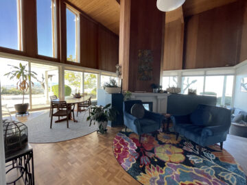
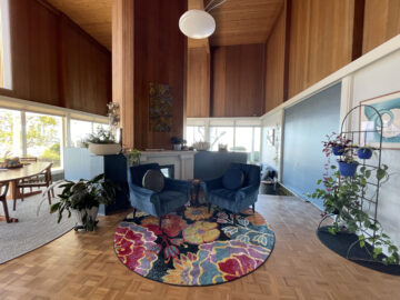
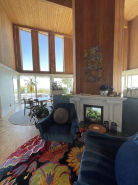
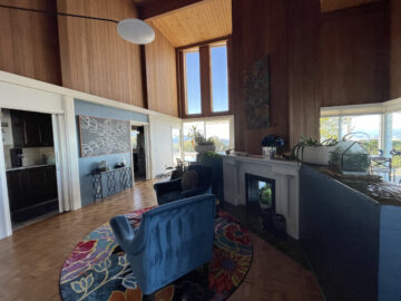
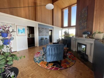
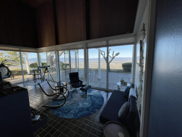
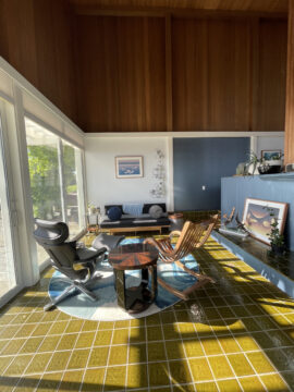
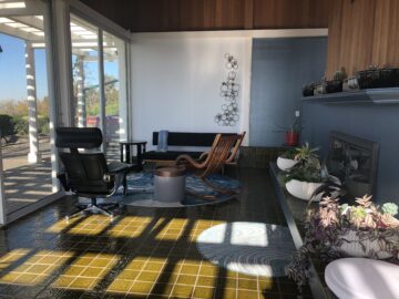
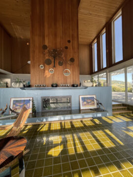
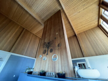
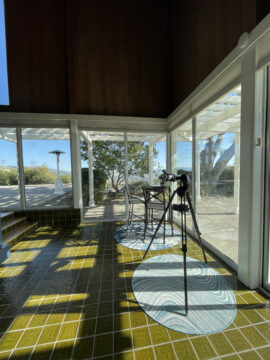
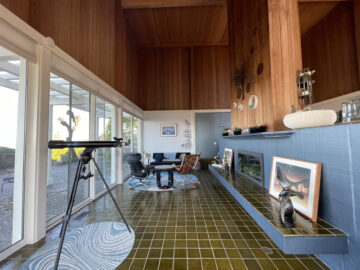
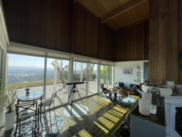
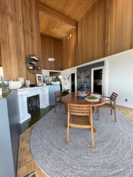
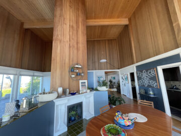
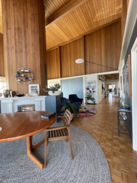
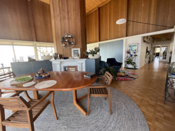
Since the great room is just a giant cube with 16 giant rectangular windows, square tiles in the lower section, square openings into the cavernous fireplace, and square sections of wall separated by giant pillars that support the structure as constructed, t really feels like boxes within boxes within boxes. When I started imagining what to do with the space, I decided to shy away from anything “square.” This included furniture, rugs, and even the art we’ve added to the space. (And yes, the art is all in rectangular frames, but the frames match the wood flooring and all the serigraphs and paintings have curves!)
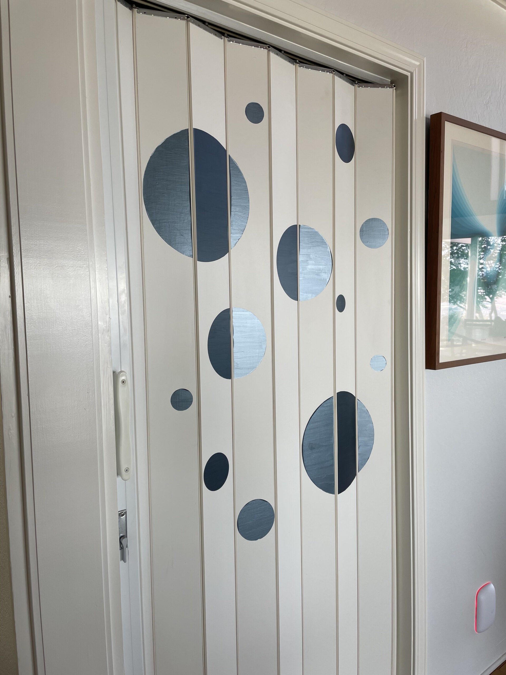
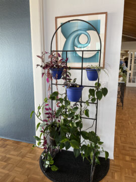
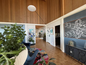
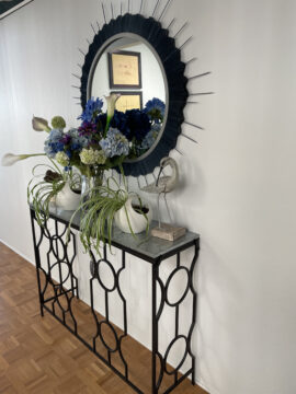
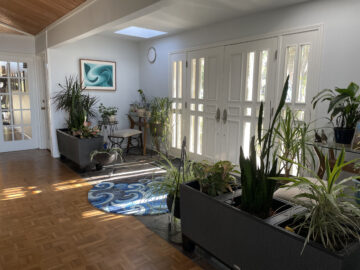
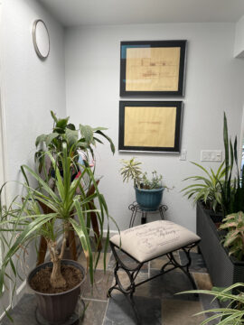
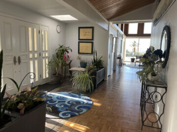
I even created some snazzy circles with my Cricut that are painted with the same metallic blue on the walls. These spruce up the coat closet accordion doors. An arched metal plant stand that I’ve had since I lived in Ohio (purchased long ago from Pier 1 Imports) frames one of the serigraphs and provides climbing space for plants. The metal console tables I found several years ago at a non-defunct craft store have circles along the bottom, plus the set of circle trellises on the wall provide a space for air plants. I could go on and on, but you get the idea. The end result is a space has various areas of interest that now flows out to the foyer.
Sure, I still need to make curtains for the dining area and an ottoman for the sitting area, and there will eventually be a small set of shelves and console tables in the dining area and a lamp or two downstairs, but the space is just about “done.”

