During our random discussions about what to do paint and furniture-wise in the great room, Agent Smith pointed me to an online website that promised to create a custom design for any space. Apparently you can “see your exact room, expertly designed in 3D with actual pieces of furniture from well-known retailers that you can buy on the spot.”
So I paid them a bit of money and uploaded photos of the great room per the instructions. While their attempt wasn’t awful, it was so very beige. No inspiration, no whimsy and most importantly no sense of place. I might have used the service more, but the UI for editing was just so clunky I gave up.
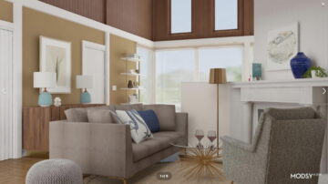
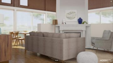
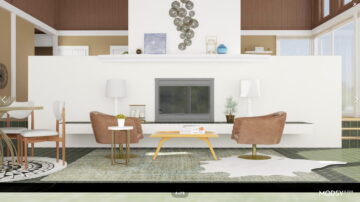
The “designer” kept the awful mustard on the walls and then blanked everything else to white. In the upper sitting area, they shoehorned in a couch which would effectively close off that space. I have no idea why the picture on the chimney column was placed so low either.
This is what they proposed for the space.
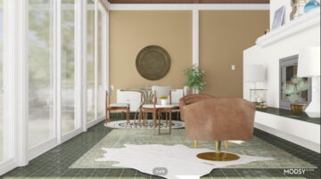
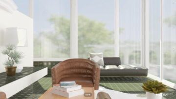
The low hanging “art” was repeated again in the downstairs area, and on top of that, there was no real attempt to be creative with the space. They just plunked down a second dining table and a couple of chairs that really would have been better suited in the upper area. Then in the south corner, the only interesting suggested element of the whole lot was a black daybed/couch. Problem was that it was sitting there like a wee orphan suitable for use only by anti-social visitors or a cat, if we had one.
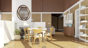
Then in the dining area they suggested a cheap-looking and very unsuitable (size-wise) table. If there is one spot to put a large table, it’s that area. A table for ten or twelve would make use of the space, but instead they suggested this.
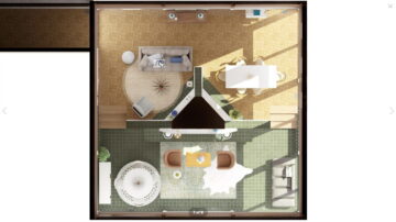
You can get a good sense of just what I mean by no “flow” in the room via the overhead render.
In the end, I think I did a much better job on my own and I found a better black day bed…
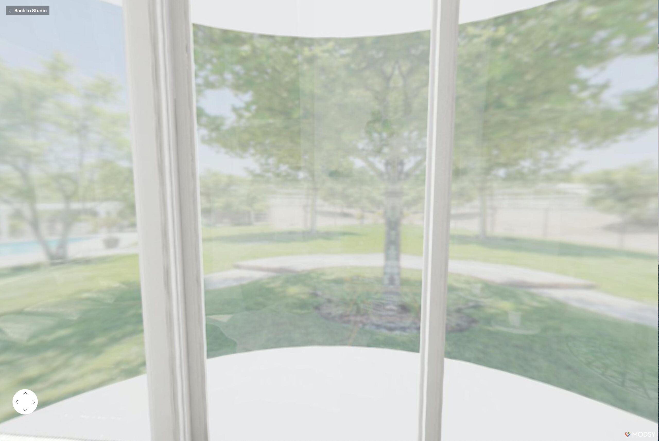
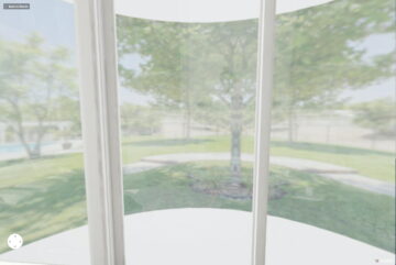
Perhaps the most amusing bit of the whole exercise was the very corporate office park feel they created for our view.

